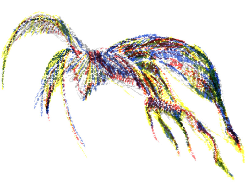
Commitment: the state of being emotionally impelled to do something. My commitment is to making art, loving life and doing well.

Daily Artworks... my continuing challenge for 2015: Observe and record. Record and observe. And stretch - s-t-r-e-t-c-h - myself.
What will I discover?

Showing posts with label daily. Show all posts

Thursday, August 6, 2015

Torngats 2015 - Where Nature and Culture Connect 06

The Cafeteria


Meals at the Base Camp...  
...are hearty, generous and filling.   

The kitchen staff sets out breakfast, lunch and supper every day for staff and visitors to the Base Camp. Keeping nutrition and variety in mind, the cooks prepare breakfasts of bacon, sausages, pancakes, and porridge or beans, and people can serve themselves with cereals, toast and beverages. Folks leaving camp for the day prepare their own lunch from the sandwich and snack buffet, while the noon meal at the Base Camp is usually homemade soup with a sandwich. Supper is a full cooked meal, either good substantial camp food, or fresh-caught country food like trout, char, seal, rock cod, all prepared home-style.  


Wednesday, August 5, 2015

Torngats 2015 - Where Nature and Culture Connect 05

The Daily Schedule


Every day camp assignments are posted...  
...for visitors, bear guards, park staff, pilots, drivers, and other Base Camp personnel.   

At the time we were in camp, there was also a group of hikers from a college in Vermont, a film crew from Japanese television, a group of natural scientists, and several park researchers, all going to different places in the park. All our activities were co-ordinated to make efficient use of the boats, helicopters, bear guards, park interpreters, food preparation, and on-the-land camping facilities that the Base Camp provides.         


Monday, July 16, 2012

July Challenge- The REVEAL: Limited Palette, Limited Content #3

Challenge Drawing Game - The REVEAL
Red-Orange, Purple, Pale Blue: Script
Digital drawing, 10240px x 768px


This month, I have joined several internet friends in a challenge - create three pieces with a mandatory limited palette of only three colors: red-orange, purple and pale blue, and three words: "energy", "life", and "passion." All these elements were independently selected by the players.

I am a painter, of landscapes mostly, so I am used to working with images. Even when I am doing things like web design or posters where words are part of the content, overall I am concerned the look of the text in the design, and not so much with the meaning of the words.

At first, in this challenge, I found the required words to be just-plain excess baggage. Somehow, I had to incorporate them into the design. So they became another item to be balanced, repeated, proportioned, or scaled appropriately.

Gradually I became aware of using the meaning of the word in the piece, and I experimented with how the visual design supported or enhanced or detracted from that meaning in the drawing.

Then I found myself at a crossroads. What is my intent in doing the design? Am I trying to communicate the literal meaning of the word or words? Am I making a statement or exhortation with or about these words? Or am I making a visual design that speaks to the viewer at a subconscious as well as a conscious level? What do I want these words to do? What do I want my design to do?

So, that is where I will continue this line of inquiry. This challenge has been a good couple of weeks of daily practice, I have learned a lot about the software package I wanted to try out, and I have learned a surprising amount about my own approach to my work.

This is the last REVEAL - the third of three pieces for this challenge - let me know what you think!


.

.

July Challenge- The REVEAL: Limited Palette, Limited Content #2

Challenge Drawing Game - The REVEAL
Red-Orange, Purple, Pale Blue: Flower with Words
Digital drawing, 10240px x 768px


This month, I have joined several internet friends in a challenge - create three pieces with a mandatory limited palette of only three colors: red-orange, purple and pale blue, and three words: "energy", "life", and "passion." All these elements were independently selected by the players.

Over the years, I have developed a routine of writing daily journal entries - nothing grand, it's mostly a morning mind-dump and sometimes a planning-session. Over the years, I have also learned that when I keep my sketchbook active every day, my drawing warms up with the practice. I know that what I am putting onto paper like this is not "great art" and it doesn't have to be, it's a routine, like brushing my teeth or doing the dishes. And it's necessary to me in the same way. So I welcomed this challenge as something that I could include in my daily routine.

What have I gotten out of it? Well, the elements of the challenge were different enough from what I am used to, that I had find new ways, every day, of making my drawings. And because I set my own challenge of using different tools as well, I have had to find different problem-solving strategies to come up with appropriate solutions to the challenge. In other words - I had to stretch myself to play this game, to meet this challenge.

And that's the fun of it - being playful, being creative, and refreshing myself.

So, this is the REVEAL - the second of three pieces - let me know what you think!


.

.

July Challenge- The REVEAL: Limited Palette, Limited Content #1

Challenge Drawing Game - The REVEAL
Red-Orange, Purple, Pale Blue: Stripes with Words
Digital drawing, 10240px x 768px

Playfulness is the foundation for creativity. One of the foundations of playfulness is "rules" - what you allow to happen, and also what you eliminate from consideration - the rules of the game.

This month, I have joined several internet friends in a challenge - playing with a mandatory limited palette of only three colors: red-orange, purple and pale blue (each color independently selected by a player) and three words: "energy", "life", and "passion" (also independently selected.) Making these arbitrary limitations work together is the creative challenge. How I do it is my own solution, how I play the game.

I have added my own personal challenge to this game - I am trying out a drawing package for the iPad - and this game has been a perfect test for the past couple of weeks to put the new software through its paces, one digital drawing at a time, one daily session at a time.

This has been a "secret challenge" in that none of us participants knows, until now, what the others are drawing, how they are playing the game.

So, this is the REVEAL - let me know what you think!


.

.

Tuesday, June 21, 2011

Monochrome Color Scheme - Green

Monochrome Color Scheme - Green

.

Digital drawing, 800 px x 600 px
.
The human eye can detect more tints and shades of green than any other color. I guess this is because we evolved in the trees needing to identify food plants and plants for other uses.

In this drawing, I used dark and middle dark shades of green, a saturated green and a pale green, plus a black line drawing to pull the design together.
.

.

Monday, June 20, 2011

Monochrome Color Scheme - Red

Monochrome Color Scheme - Red

.

Digital drawing, 800px x 600 px
.

This is the final version of the monochrome image, with the four layers for pale pink, rose, saturated red and brown opened on top of each other. The black layer that you saw earlier is hidden.

All these colors are based on a hue (color) of red, with variations on their saturation (intensity) and their value (lightness or darkness.)
.

.

Sunday, June 19, 2011

Monochrome Color Scheme - Red [Level 2 - The Brown Layer]

Monochrome Color Scheme - Red [Level 2 - The Brown Layer]
.


Digital Drawing, 800 px x 600 px
.


I am working through the various color levels in this image, and placing each color on a separate layer. This makes it easier for me to see the effect of each color on the entire drawing, and yet make corrections, if I find it necessary.


This layer shows the brown tone in this design. Of its hue, saturation and value, the hue is red, the saturation is full, and the intensity is about half that of a brilliant red. That is the only difference between the colors brown and red, they're the same, but brown is darker.


Still more to come!

.


.

Saturday, June 18, 2011

Monochrome Color Scheme - Red [Level 1 - The Black Layer]

Monochrome Color Scheme - Red [Level 1 - The Black Layer]


.


Digital drawing, 800 px x 600 px
.

My working method for these digital drawings is to use layers to separate the colors I am using. I am finding that each layer has its own charm and individual beauty beyond its contribution to the finished drawing.

Although the basic hue in this monochrome image is Red, my starting point is usually a drawing in black to establish fundamentals of value and contrast, and to place the various shapes and areas of tone. So, from my work-in-progress, here is the black component.


There's more to come!
.

.

Friday, June 17, 2011

Monochrome Color Scheme - Yellow

Monochrome Color Scheme - Yellow
.


Digital drawing, 800 px x 600 px
.

Monochrome means one color, and this monochrome color scheme is based on the single hue of yellow.
Other characteristics of color are saturation and value. There is only one saturated yellow in this design, all the other yellow tints and yellow shades are based on this one hue.

The background is a neutral gray, to provide contrast against the yellows.
.

.

Thursday, June 16, 2011

Analogous Colors: Violets

Analogous Colors: Violets


.


Digital drawing, 800 px x 600 px
.

Violet is a mixture of red and blue. Analogous relationships based on violet hues include red-violet, violet, blue-violet and blue. Combinations of tones of violets give a cool quiet sensation in a design.


.


.

Wednesday, June 15, 2011

Analogous Colors: Oranges

Analogous Colors: Oranges
.


Digital drawing, 800 px x 600 px
.

The relationship between these analogous colors is with the hue orange, a secondary color made up of the primary colors red and yellow. These are all warm colors as well, and the red, red-orange, orange, yellow-orange, and yellow shine against a flat black background.
.

.

Tuesday, June 14, 2011

Analogous Colors: Blues

Analogous Colors: Blues
.

Digital drawing, 800px x 600px
.

Analogous colors are related, they share a common hue, and they can be found next to each other on the color wheel. This abstract landscape drawing is made up of yellow-green, green, blue-green, blue, and blue-violet. All these colors contain a proportion of blue, and because of this relationship, they remain harmonious when they are used together.
.

.

Monday, June 13, 2011

Color Triads: Red-Orange, Red-Green, Yellow-Green

Color Triads: Red-Orange, Red-Green, Yellow-Green

.


Digital drawing, 800px x 600px
.

A tertiary triad is made up of three colors which are each mixed from a primary color and a secondary color. The use of tertiary colors in a design gives a subtle effect and provides backgrounds that contrast strongly with saturated primary and secondary colors.
.

.


Sunday, June 12, 2011

Color Triads - Orange, Green, Violet

Color Triads - Orange, Green, Violet


.


Digital drawing, 800px x 600px
.

The color scheme of a secondary triad is made up of the three secondary colors, orange, green and violet. This combination gives an energetic feeling to a composition, but the impact of the colors is not as intense as from a display of the primary colors.


.


.

Saturday, June 11, 2011

Color Triads - Red, Yellow, Blue

Color Triads - Red, Yellow, Blue
.


Digital drawing, 800px x 600px
.

Most of the emotional impact of a design comes from the artist's choice of colors, sometimes called the color scheme. Many color schemes are based on three colors, called triads. The triad of red, yellow and blue is called the primary triad, because it is composed only of primary colors and it gives the sensation of being bold and lively.
.

.

Friday, June 10, 2011

Cool Colors

Cool Colors

.


Digital drawing, 800px x 600px
.

For the month of June, I am concentrating on drawing using a digital tablet and stylus. There is some eye-hand co-ordination involved in this, and developing different methods, but in the end, drawing is still drawing and making-images is still making-images. I know there will be a lot of experimentation here, so we're in for some interesting sailing.

This image demonstrates a cool color scheme, using green, blue-green, blue, and blue-violet against a greyscale background.

Speaking of sailing, this drawing is of the Norma and Gladys, one of the last wooden fishing vessels from Newfoundland, built in 1945, used in the Labrador fishery until 1951, turned into a floating museum in 1973 and lost at sea in 1984.
.

.

Sunday, May 15, 2011

Warm Colors

Warm Colors


.

Colored pencil on paper, 6.5" x 10"
.


The colors we know can be divided into two groups - warm colors and co0l colors. We can place a dividing line on the color wheel between yellow and violet to identify these two groups.

We generally associate red, orange and yellow hues with the sun or fire, and call them warm colors. We also associate blue, blue-green, green, and violet hues with water, sky and atmospheric conditions, and call them cool colors. However, the perceived qualities of warmth or coolness in a color can be influenced by other colors near it.

In this drawing, I used twelve separate pencil colors, six highly-saturated colors from the color wheel, two browns and four paler tones of yellows and pinks.
.

.

Saturday, May 14, 2011

The Color Wheel

The Color Wheel
.


Colored pencil on paper 7.5" x 7.5"
.


Studying color relationships has been part of an artist's education for centuries, and the color wheel is a visual aid for exploring and organizing the use of colors.

A color wheel takes the spectrum of hues, red, orange, yellow, green, blue and violet, in the order that they appear in when white light is split by a prism, and wraps them around into a circle. Seeing color relationships becomes easy using this chart.

Complementary color pairs (red/green, blue/orange, yellow/violet) appear on opposite sides of the color wheel. The intervals of triads of colors, such as primary colors (red, yellow, blue) or secondary colors (orange, green, violet), create triangles within the color wheel. And using a color wheel, an artist can easily identify analogous colors which sit next to each other, or warm and cool colors which fall on one side or the other of the color wheel.

Using color relationships in a painting or a drawing lets an artist select colors that will best communicate the intended meaning of the artwork, and the color wheel is an efficient visual aid for identifying those relationships.
.

.

Friday, May 13, 2011

Complementary Blends 3 - Yellow and Violet

Complementary Blends 3 - Yellow and Violet


.


Colored pencil on paper, 6.5" x 10"
.


When colors are chosen and organized in particular ways, they can give a three-dimensional sense to a picture. Colors that are complementary to their background tend to "pop out" or to occupy a space in front of the background.

Yellow is a high-value warm color and at its most saturated, it appears to "advance" or be closer to the viewer. Violet is a cool color and at low intensity it tends to "recede." In this drawing, the triangle of bright yellow appears to be floating in front of its background. The background of the various greyish-browns resulting from mixing the single spectrum-yellow and spectrum-violet seems to fall back behind that central rectangle.

Knowing how colors behave in combination with other colors is vital when an artist wants to emphasize an area of an image, or wants to develop a composition that leads the viewer's eye through the picture.


.


.


Followers

Blog Archive

.