Commitment: the state of being emotionally impelled to do something. My commitment is to making art, loving life and doing well.

Daily Artworks... my continuing challenge for 2015: Observe and record. Record and observe. And stretch - s-t-r-e-t-c-h - myself.
What will I discover?

Showing posts with label primary colors. Show all posts

Saturday, June 11, 2011

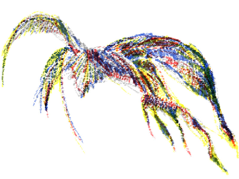
Color Triads - Red, Yellow, Blue

Color Triads - Red, Yellow, Blue
.


Digital drawing, 800px x 600px
.

Most of the emotional impact of a design comes from the artist's choice of colors, sometimes called the color scheme. Many color schemes are based on three colors, called triads. The triad of red, yellow and blue is called the primary triad, because it is composed only of primary colors and it gives the sensation of being bold and lively.
.

.

Saturday, May 14, 2011

The Color Wheel

The Color Wheel
.


Colored pencil on paper 7.5" x 7.5"
.


Studying color relationships has been part of an artist's education for centuries, and the color wheel is a visual aid for exploring and organizing the use of colors.

A color wheel takes the spectrum of hues, red, orange, yellow, green, blue and violet, in the order that they appear in when white light is split by a prism, and wraps them around into a circle. Seeing color relationships becomes easy using this chart.

Complementary color pairs (red/green, blue/orange, yellow/violet) appear on opposite sides of the color wheel. The intervals of triads of colors, such as primary colors (red, yellow, blue) or secondary colors (orange, green, violet), create triangles within the color wheel. And using a color wheel, an artist can easily identify analogous colors which sit next to each other, or warm and cool colors which fall on one side or the other of the color wheel.

Using color relationships in a painting or a drawing lets an artist select colors that will best communicate the intended meaning of the artwork, and the color wheel is an efficient visual aid for identifying those relationships.
.

.
Thursday, May 5, 2011

Color Variations 5 - Primary Colors

Color Variations 5 -Primary Colors


.


Colored pencil on paper, 6.5" x 10"
.

The primary colors are called that because they are the three colors which cannot be mixed from any other colors, and from which any other colors can be mixed.

The appearance of the red and yellow and blue colors will vary in different pigments, paints or other art supplies, but if you have any red, any yellow and any blue, you will be able to mix other colors from them.

In this drawing, the red I chose appears to be more of a red-orange than a true spectrum red, and the blue is not as saturated as a true spectrum blue, but the yellow is very close to a true spectrum yellow. Remember, too, that computer monitors are not all calibrated equally and that color-matching is a pretty imprecise science. What you see is what you get!


.


.

Saturday, November 21, 2009

Art Every Day Month - November 21

Mixing Relationships between Colors


We're all familiar with the standard circular color wheel, showing the primary colors of red, yellow and blue, and their relationships to a number of other colors. Color wheels have been tools of scientific examination since the days of Sir Issac Newton who used prisms to split white light from the sun into a continuous spectrum of colors.

What I did for today's Art Every Day for the Month challenge is more of a color mixing chart than a color wheel. I arranged four base colors, alizarin crimson, lemon yellow, viridian, and prussian blue, into the four corners of the rectangle. The two blocks in between each pair of base colors show the colors mixed from those pairs, across the top, bottom, sides and diagonally through the center of the rectangle.

If I had paid a bit more attention while I was working, I might have mixed up enough fluid colors to paint flat washes on each of the 16 blocks. I might also have been a bit more precise about the proportions of base colors I used, and even paid some attention to the tinting strength of the base colors, too. Lessons learned for next time.

But even this simple mixing chart demonstrates the intermediary relationships between these four base colors, and that's what I was hoping it would do.

Sunday, November 8, 2009

Art Every Day Month - November 8

Transparent wet in wet washes


I did today's painting in transparent washes, wet into wet, with three primary colors, magenta, prussian blue and permanent yellow.

As I progressed from one block to the next, I began to see the painting as a whole. So, instead of accepting each little arrangement on its own terms, I did a final overall retouching to balance the entire composition.

It still reminds me of a Hawaiian shirt fabric, so perhaps it's time to get out the silkscreens and do some yardage!

Followers

Blog Archive

.