 Color Layers
.
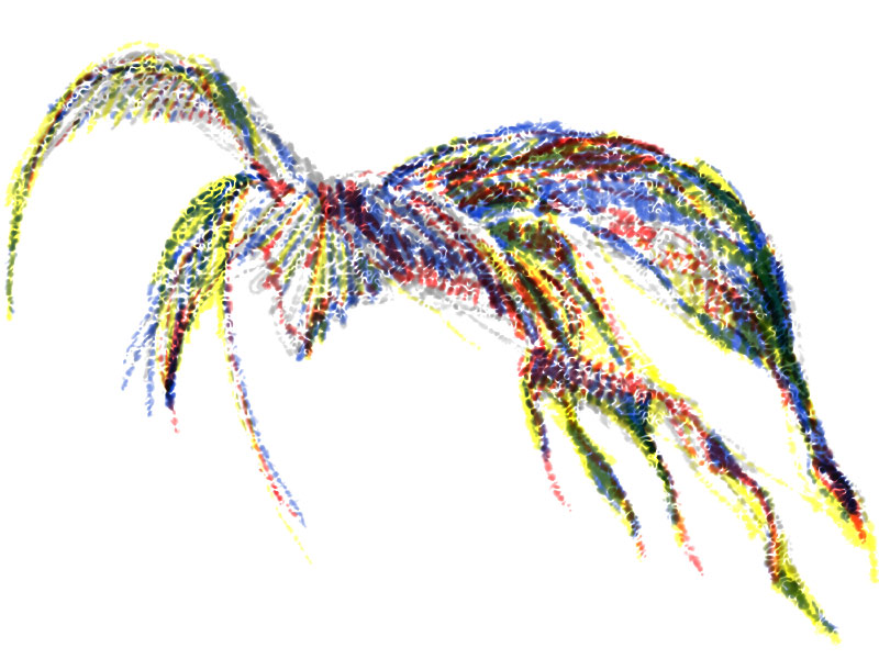
Digital drawing, 800px x 600px
.
Colors put on separate layers in a digital drawing can be "mixed" differently, depending on the order in which the layers are stacked. When the colors are completely opaque, the one on top masks the one beneath, and so on to the bottom of the stack. When the opacity of the colors is adjusted, an artist can control the blending of the colors.
.
.


